

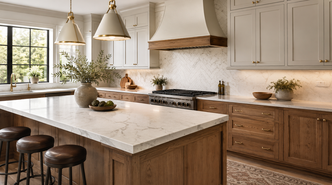
Creating a Kitchen That Feels Thoughtfully Designed
Cabinets and countertops are two of the most noticeable features in any kitchen. They cover a large amount of visual space, influence how the room feels, and need to work together through years of meals, gatherings, cleaning, and everyday activity.
When these surfaces coordinate well, the kitchen feels balanced and intentional. When they compete with each other, even beautiful individual materials can make the room feel busy or disconnected.
Hazel Green homeowners do not need every surface to match perfectly. In fact, successful kitchen designs often combine different colors, textures, and patterns. The key is to create a clear relationship between the cabinets and countertops through shared undertones, balanced contrast, or a consistent design style.
Homeowners planning a kitchen update can visit One on One Flooring and Design to compare cabinet and countertop combinations with help from a knowledgeable local team. The family-owned business has served Hazel Green, Huntsville, and communities throughout the Tennessee Valley for more than 40 years.
Whether the goal is a warm farmhouse kitchen, a clean contemporary space, or a timeless traditional design, the right pairing starts with understanding color, pattern, practicality, and the overall atmosphere you want to create.
Start with the Feeling You Want from the Kitchen
Before comparing cabinet doors or countertop samples, think about how the finished kitchen should feel.
Some homeowners want a bright, open room that feels clean and relaxed. Others prefer a warm kitchen with natural wood tones and inviting textures. A dramatic space may use dark cabinets and boldly veined countertops, while a timeless kitchen may rely on soft neutrals and understated patterns.
Ask a few practical questions:
Should the kitchen feel light and airy or rich and cozy?
Do you prefer modern, traditional, farmhouse, transitional, or another style?
Will the kitchen connect directly to a living or dining area?
Which existing finishes will remain?
Do you want the cabinets or countertops to become the main feature?
How much visual pattern feels comfortable?
How much natural and artificial light does the room receive?
Answering these questions gives the project direction. Without a clear goal, it is easy to select several attractive materials that do not create a cohesive room.
The kitchen also needs to reflect the home. A sleek, high-contrast design may look impressive in a contemporary property but feel disconnected from a house filled with traditional trim and warm hardwood. A good kitchen can feel refreshed without appearing unrelated to the rooms around it.
Choose Which Surface Will Lead the Design
Cabinets and countertops can both make a strong visual statement, but asking them to compete equally may result in an overly active design.
A clearer approach is to choose one surface as the focal point and allow the other to provide support.
Let the Countertop Take Center Stage
A countertop with bold veining, visible mineral movement, or high color variation naturally attracts attention. When using an expressive granite or quartz pattern, quieter cabinet finishes can help the countertop stand out without overwhelming the room.
Suitable cabinet choices may include:
Soft white
Warm cream
Light gray
Muted greige
Simple natural wood
Deep navy or black for controlled contrast
The cabinet door style can also remain relatively simple. A clean Shaker-style profile, for example, often gives an active countertop enough visual room.
Make the Cabinets the Main Feature
Colorful cabinets, detailed door profiles, or distinctive natural wood grain can become the kitchen’s primary design element. In this case, a quieter countertop often creates a better balance.
Consider countertops with:
A consistent background color
Fine, subtle veining
Low pattern variation
Small mineral details
A soft matte or polished appearance
This approach allows the cabinetry to remain the visual focus while the countertop provides a clean, dependable work surface.
Create a Balanced Partnership
Some homeowners prefer neither surface to dominate. This can work especially well in transitional kitchens that combine traditional warmth with streamlined details.
Choose cabinet and countertop materials that share a similar visual weight. A medium-tone wood cabinet may pair well with a lightly patterned cream countertop, while muted blue cabinetry can coordinate with a soft white surface containing gentle gray movement.
Understanding Warm and Cool Undertones
One of the most important parts of matching cabinets and countertops is identifying undertones.
A color may appear white, gray, beige, or brown at first glance, but subtle undertones can make it lean warm or cool. Warm finishes may include hints of yellow, red, gold, cream, or orange. Cool finishes may contain blue, green, violet, or crisp gray notes.
Warm Cabinet Undertones
Warm cabinet finishes often include:
Creamy white
Honey oak
Cherry
Walnut
Warm beige
Golden brown
Red-toned wood
These finishes usually coordinate well with countertops that contain cream, tan, gold, brown, or warm gray.
A cream cabinet beside a blue-gray countertop may look mismatched if the undertones are too far apart. However, a countertop that combines warm cream with a small amount of gray can help bridge the two surfaces.
Cool Cabinet Undertones
Cool cabinet colors may include:
Crisp white
Blue-gray
Charcoal
Navy
Cool taupe
Green-gray
Black
These colors often pair naturally with countertops containing white, gray, black, blue-gray, or cool veining.
Cool finishes can create a clean, contemporary appearance, but balance is still important. A kitchen filled with cool gray surfaces may feel flat without natural wood, warm lighting, metal accents, or another contrasting material.
Neutral Does Not Always Mean Universal
Greige, taupe, white, and gray are often described as neutrals, but they still carry undertones. A warm greige cabinet may look beautiful with beige-veined quartz and less successful beside an icy white countertop.
Compare physical samples next to each other rather than relying on color names. Manufacturers may use similar names for finishes with very different undertones.
Classic Cabinet and Countertop Pairings
Certain combinations remain popular because they are adaptable, attractive, and easy to coordinate with flooring, backsplashes, hardware, and wall colors.
White Cabinets with Granite Countertops
White cabinetry can make a Hazel Green kitchen feel brighter and more open. It also gives homeowners flexibility because it can work with many granite colors and patterns.
For a warm traditional kitchen, consider granite with:
Cream or beige backgrounds
Brown mineral details
Soft gold movement
Warm gray variation
For a bolder appearance, white cabinets can be paired with dark granite containing black, charcoal, brown, or subtle metallic details.
Highly patterned granite adds character, so keep the backsplash and surrounding finishes relatively quiet. A simple tile backsplash can support the countertop without creating too many competing patterns.
White Cabinets with Quartz Countertops
White-on-white kitchens can feel fresh and spacious, but the two whites need to coordinate.
Cabinet paint may lean warm, cool, or neutral. The quartz background should complement that undertone rather than make one surface appear yellow or gray by comparison.
A lightly veined quartz countertop can add movement to white cabinetry while maintaining a clean look. For more contrast, consider a medium gray, charcoal, or near-black quartz surface.
Use texture to prevent an all-white kitchen from feeling flat. Wood flooring, woven seating, warm hardware, textured tile, and layered lighting can add visual depth.
Natural Wood Cabinets with Light Countertops
Wood cabinets bring warmth and variation into a kitchen. Light countertops can balance that richness and keep the room from feeling heavy.
Oak, maple, hickory, walnut, and other wood finishes may work well with:
Cream quartz
Soft white granite
Beige stone patterns
Warm gray surfaces
Light countertops with restrained veining
Pay attention to the strongest color in the wood grain. A countertop does not need to match the wood, but including a related tone within the pattern can create a natural connection.
For cabinets with a highly varied grain, choose a countertop with less movement. This prevents both surfaces from competing for attention.
Gray Cabinets with White or Charcoal Countertops
Gray cabinets can support modern, transitional, and farmhouse-inspired designs. The final look depends on the undertone and the amount of contrast.
Light gray cabinets with soft white countertops create a gentle, low-contrast appearance. Medium gray cabinets paired with brighter white surfaces look more defined. Charcoal countertops can create a sophisticated tonal design when used with lighter gray cabinetry.
Avoid choosing every surface from the same middle-gray range. The kitchen may lose definition if the cabinets, countertops, flooring, and walls are too similar.
Navy Cabinets with White Countertops
Navy cabinetry adds color while remaining versatile. It can make an island stand out or create a dramatic full-kitchen design.
Soft white or lightly veined countertops help balance the depth of navy cabinets. Bright white creates crisp contrast, while a warmer white can produce a more relaxed result.
Navy also works with several hardware finishes, including brushed brass, polished nickel, matte black, and stainless steel. Choose one primary finish and repeat it thoughtfully throughout the room.
Black Cabinets with Light Countertops
Black cabinets can create an elegant and modern kitchen, especially in rooms with generous light.
Pairing them with white, cream, or lightly patterned countertops prevents the room from becoming visually heavy. Warm wood flooring or natural accents can soften the contrast.
In smaller or darker kitchens, consider using black on the island or lower cabinets while keeping upper cabinetry lighter. This provides drama without closing in the room.
Cream Cabinets with Warm Countertops
Cream cabinetry can create a welcoming kitchen that feels softer than bright white. It works particularly well in traditional and farmhouse-inspired homes.
Pair cream cabinets with countertops containing:
Beige
Warm white
Gold
Brown
Soft taupe
Warm gray
Avoid placing cream cabinets beside an extremely cool white countertop unless another material intentionally connects the two tones.
Using Two Cabinet Colors in One Kitchen
Two-tone cabinetry can add depth and create a customized look. A common approach is to use one color on the perimeter and another on the island.
Popular combinations include:
White perimeter cabinets with a navy island
Cream cabinets with a natural wood island
Light gray cabinets with a charcoal island
White upper cabinets with darker lower cabinets
Natural wood lower cabinets with painted upper cabinets
When selecting cabinets for a two-tone kitchen, use the countertop to connect the different finishes. A countertop containing subtle references to both cabinet colors can make the combination feel intentional.
For example, white perimeter cabinets and a walnut island may coordinate beautifully with a warm white countertop that includes soft brown or taupe veining.
The two cabinet colors do not need to appear in equal amounts. One may serve as the primary finish while the other creates an accent.
Keep other design elements controlled. Two cabinet finishes, a highly patterned countertop, a decorative backsplash, and a strongly patterned floor may create more visual activity than the room needs.
Coordinating Countertops with Cabinet Door Styles
Color is important, but the shape and detail of the cabinet door also affect which countertop looks most appropriate.
Shaker-Style Cabinets
Shaker cabinets feature a clean frame and recessed center panel. Their simple structure allows them to work with many countertop designs.
They can support:
Lightly veined quartz
Bold granite
Solid or nearly solid surfaces
Warm traditional colors
High-contrast combinations
Shaker cabinets are often used in farmhouse, transitional, and contemporary kitchens because they adapt easily to different hardware and finishes.
Flat-Panel Cabinets
Flat-panel doors have a streamlined appearance. They work well with modern countertops, including concrete-inspired designs, dramatic veining, and clean monochromatic colors.
Because the cabinet profile is simple, the countertop can provide movement without making the kitchen feel overly detailed.
Traditional Raised-Panel Cabinets
Raised-panel doors have more depth and decorative detail. They often pair well with granite or quartz patterns that include warm, natural movement.
If the cabinet profile is ornate, avoid adding too many additional patterns. A detailed cabinet, busy countertop, decorative backsplash, and patterned floor may compete.
Glass-Front and Accent Cabinets
Glass doors, open shelving, or decorative cabinet sections introduce additional visual details. A quieter countertop can help keep the design balanced.
The items displayed behind glass also become part of the color palette. Dishes, glassware, and decorative pieces may reinforce or contrast with the cabinet and countertop combination.
Matching Cabinets and Countertops with Flooring
Cabinets and countertops do not exist in isolation. Flooring covers another large visual area and needs to coordinate with both.
The floor does not need to match the cabinets. In fact, an exact wood-on-wood match may make the room feel flat. Aim for visible but controlled contrast.
Wood Cabinets with Wood-Look Flooring
When using both wood cabinets and wood-look flooring, vary at least one of the following:
Color depth
Grain size
Undertone
Plank direction
Texture
Dark walnut cabinets may pair well with a lighter natural oak floor. Honey-toned cabinets may work with a medium brown floor that has a quieter grain.
Compare samples together to make sure the undertones complement each other.
Painted Cabinets with Wood-Look Flooring
Painted cabinets allow wood-look flooring to bring warmth into the room. White, gray, navy, green, or black cabinetry can all work with natural wood tones.
Repeat the floor’s warmth through small details such as cutting boards, stools, shelves, or decorative accents.
Patterned Countertops with Quiet Flooring
If the countertop has bold movement, a quieter floor can prevent visual competition. Choose flooring with controlled variation and a color that supports the overall palette.
A strongly patterned floor may work better with a more consistent countertop.
The Role of Backsplashes and Hardware
The backsplash sits directly between the cabinets and countertops, making it an important connecting element.
A simple backsplash is often the safest choice when the countertop contains strong veining or movement. Consider:
Solid subway tile
Softly textured ceramic tile
Small-scale neutral patterns
A countertop material extended up the wall
If both the cabinets and countertops are understated, the backsplash can become a stronger feature through color, shape, or pattern.
Hardware provides another opportunity to define the style. Brushed brass can add warmth, polished nickel can feel classic, matte black creates contrast, and stainless steel coordinates with many appliances.
Do not feel pressured to match every metal finish exactly. A kitchen can include more than one finish, but repetition helps the design feel organized.
Practical Details That Affect the Final Choice
A successful pairing needs to support everyday life as well as appearance.
Cleaning and Maintenance
Consider how much visible pattern you prefer and how it may affect daily care. Very dark, solid surfaces may show dust, crumbs, or fingerprints more readily. Highly polished finishes may reveal streaks under direct light.
A patterned countertop can disguise everyday marks, but too much movement may feel busy in a small room.
Cabinet finish matters as well. Detailed door profiles may require more attention than flat surfaces, while certain colors show fingerprints more easily than others.
Lighting Conditions
Natural and artificial light can change the way colors appear. Morning light may reveal different undertones than evening lighting.
View samples:
Near windows
Beneath existing kitchen lights
During daytime
After sunset
Beside the flooring
Next to wall paint
A countertop that appears warm in a showroom may look cooler at home. Physical samples provide a more reliable picture than online images alone.
Kitchen Size
Light cabinets and countertops can help a small kitchen feel more open, but dark colors are not automatically unsuitable. A dark island, lower cabinet, or accent wall can add depth without overwhelming the room.
Large kitchens can handle more contrast and pattern, but scale still matters. A dramatic countertop may look different across a full island than it does in a small sample.
Long-Term Appeal
Trends can provide inspiration, but major kitchen surfaces need to suit the homeowner’s taste for years.
A balanced design often combines a timeless foundation with easier-to-change accents. Cabinets and countertops may remain relatively versatile, while paint, lighting, stools, hardware, and decor introduce current colors or finishes.
Common Pairing Mistakes to Avoid
Even experienced shoppers can become distracted by individual samples. Watch for these common issues:
Choosing Materials Separately
A cabinet finish selected months before the countertop may create coordination problems later. Compare all major surfaces before finalizing the order.
Ignoring Undertones
Two neutral colors can still clash. Place the samples directly beside one another and look for shared warm or cool notes.
Using Too Many Strong Patterns
Wood grain, countertop veining, decorative tile, and patterned flooring can all be beautiful. Using all of them at full intensity may make the room feel crowded.
Relying Only on Small Samples
Small samples may not show the full variation of natural stone, wood grain, or veining. Review the largest samples available and ask about the range of pattern variation.
Forgetting Existing Features
Appliances, flooring, wall color, trim, and adjoining rooms affect the finished design. Include any surfaces that will remain when comparing new materials.
Following a Trend That Does Not Suit the Home
A popular combination may not work with the architecture, lighting, or personality of the property. Use trends as inspiration rather than strict rules.
Bringing the Whole Kitchen Together
The best cabinet and countertop pairing is the one that fits the home, supports daily routines, and feels natural to the people using the kitchen.
Start with the desired atmosphere. Decide which surface will lead the design, compare warm and cool undertones, and view every sample under the home’s actual lighting. Coordinate the flooring, backsplash, hardware, and existing finishes before making the final choice.
Remember that successful combinations do not require perfect matching. Contrast can make a kitchen more interesting, while repeated tones and materials keep it cohesive.
One on One Flooring and Design offers cabinets, granite countertops, quartz countertops, flooring, and design support for homeowners throughout Hazel Green, Huntsville, and the Tennessee Valley. The showroom also includes many products that may not appear in the online catalog, giving homeowners more opportunities to compare finishes in person.
Ready to create a kitchen with cabinets and countertops that work beautifully together? Get in touch with the local team for personalized guidance and help exploring the available options.


